Gutenberg is more than an editor. While the editor is the focus right now, the project will ultimately impact the entire publishing experience including customization (the next focus area). Imagine a custom “employee” block that a client can drag to an About page to automatically display a picture, name, and bio. A whole universe of plugins that all extend WordPress in the same way. Simplified menus and widgets.
Say Hello to the New Editor
One thing that sets WordPress apart from other systems is that it allows you to create as rich a post layout as you can imagine — but only if you know HTML and CSS and build your own custom theme. By thinking of the editor as a tool to let you write rich posts and create beautiful layouts, we can transform WordPress into something users love WordPress, as opposed something they pick it because it’s what everyone else uses.
Full Width Cover Image
This is a subhead block, where you can add a little extra blurb about your post or page. Cool yeah?
Ordered List
- The block unifies multiple interfaces. If we add that on top of the existing interface, it would add complexity, as opposed to remove it.
By revisiting the interface. - We can modernize the writing, editing, and publishing experience, with usability and simplicity in mind, benefitting both new and casual users.
- When singular block interface takes center stage, it demonstrates a clear path forward for developers to create premium blocks, superior to both shortcodes and widgets.
Unordered List
- Considering the whole interface lays a solid foundation for the next focus, full site customization.
- Looking at the full editor screen also gives us the opportunity to drastically modernize the foundation.
- And take steps towards a more fluid and JavaScript powered future that fully leverages the WordPress REST API.
Table? Yes please!
Blocks are the unifying evolution of what is now covered, in different ways, by shortcodes, embeds, widgets, post formats, custom post types, theme options, meta-boxes, and other formatting elements. They embrace the breadth of functionality WordPress is capable of, with the clarity of a consistent user experience.
| ID | First Name | Last Name | Position | Salary |
| 1 | John | Doe | CEO | $100K |
| 2 | Jane | Trips | CTO | $95K |
| 3 | Fred | Tomas | Marketing | $84K |
Beautiful galleries
Posts are backwards compatible, and shortcodes will still work. We are continuously exploring how highly-tailored metaboxes can be accommodated, and are looking at solutions ranging from a plugin to disable Gutenberg to automatically detecting whether to load Gutenberg or not. While we want to make sure the new editing experience from writing to publishing is user-friendly, we’re committed to finding a good solution for highly-tailored existing sites.
And now for the Grid View. The Latest Posts block also displays at wide and full width alignments, so be sure to check those styles as well.
- A huge set of UI components and app screens
- Templates and Layouts Web Concept
- iMac and iMac Pro mockups
- WuHoo Scene. Mockups and Items
- Paper Bag Mockup
- Google Announces a New Governance Model for AMP
Blockquote
Nulla vitae elit libero, a pharetra augue. Morbi leo risus, porta ac consectetur ac, vestibulum at eros. Maecenas sed diam eget risus varius blandit sit amet non magna sed diam ed diam eget risus varius eget.
Donec sed odio dui. Maecenas faucibus mollis interdum. Duis mollis, est non commodo luctus, nisi erat porttitor ligula, eget lacinia odio.
Magnium, MagniumThemes
Nulla vitae elit libero, a pharetra augue. Morbi leo risus, porta ac consectetur ac, vestibulum at eros. Maecenas sed diam eget risus varius blandit sit amet non magna sed diam ed diam eget risus varius eget.
Columns
Made With Love
Cras justo odio, dapibus ac facilisis in, egestas eget quam. Sed posuere consectetur est at lobortis. Nullam id dolor id nibh ultricies vehicula ut id elit. Donec sed odio dui. Nulla vitae elit libero, a pharetra augue.
Made By Writers
Cras justo odio, dapibus ac facilisis in, egestas eget quam. Sed posuere consectetur est at lobortis. Nullam id dolor id nibh ultricies vehicula ut id elit. Donec sed odio dui. Nulla vitae elit libero, a pharetra augue.
Looking ? more?
Here is an example of the core pull quote block, set to display centered. Nulla vitae elit libero, a pharetra augue. Morbi leo risus, porta ac consectetur ac, vestibulum at eros.
Image Block
Duis mollis, est non commodo luctus, nisi erat porttitor ligula, eget lacinia odio sem nec elit. Maecenas faucibus mollis interdum.
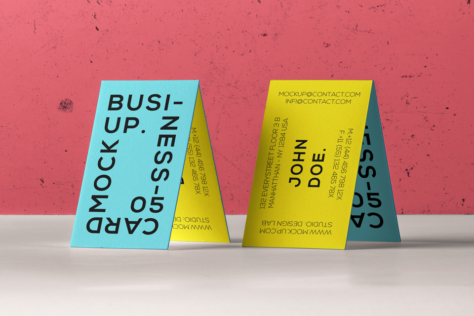
Wide aligned

Full Width
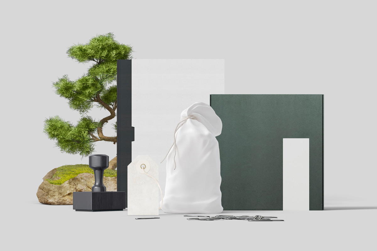
Fusce dapibus, tellus ac cursus commodo, tortor mauris condimentum nibh, ut fermentum massa justo sit amet risus. Duis mollis, est non commodo luctus, nisi erat porttitor ligula, eget lacinia odio sem nec elit.
Video Block
Lets check out the positioning and styling of the video core block. We will check the wide and full alignments too.
Wide aligned
Cover Image Block
Check out the positioning and styling of the cover image core block. We will check the wide and full alignments, as well as left/right.
Wide aligned
Wide Cover Image Block
Full Width
Fusce dapibus, tellus ac cursus commodo, tortor mauris condimentum nibh, ut fermentum massa justo sit amet risus. Duis mollis, est non commodo luctus, nisi erat porttitor ligula, eget lacinia odio sem nec elit.
Gallery Blocks
Let us check out the positioning and styling of the gallery blocks.


